Astro Skate

Brand Indentity + Environmental & Campaign Design
Date
August - October 2025
Role
Brand Designer
Software
Adobe Illustrator,
Photoshop, Figma

Reimagining Astro Skate through a modern nostalgic lens

I approached this project with the goal of bringing Astro Skate into a more modern space while still holding onto the energy and nostalgia that makes roller rinks so memorable. The focus was on creating a brand that feels immersive, expressive, and relevant today.

Rather than recreating the past, I reinterpreted it. Every element was designed to capture that neon-lit atmosphere while building a system that works across both physical and digital spaces.
Person hoplding a phonew that shows Moodify intro screen.
01  OVERVIEW

Starting with a clear vision for the experience

Astro Skate is designed for socially active young adults who are drawn to nostalgic environments and shared experiences. The goal was to create a visual identity that feels energetic, recognizable, and immersive.

From the beginning, I focused on building a system that could extend beyond a logo and translate across signage, print, and digital touchpoints.

02 THE CHALLENGE

Finding the balance between retro and modern

The challenge was balancing bold, retro-inspired visuals with a clean and intentional design system. It was important that the brand felt expressive without becoming overwhelming or outdated.

I carefully controlled color, typography, and effects to ensure the design stayed cohesive while still capturing the energy of the concept.
03 VISUAL DIRECTION

Building a bold and expressive visual language

The visual direction was inspired by arcades, neon lighting, and late-night environments. Gradients, glow effects, and high-contrast typography helped establish the tone.

At the same time, structure played a key role in keeping the system consistent and adaptable across different applications.
04 LOGO DESIGN

Exploring form, motion, and personality

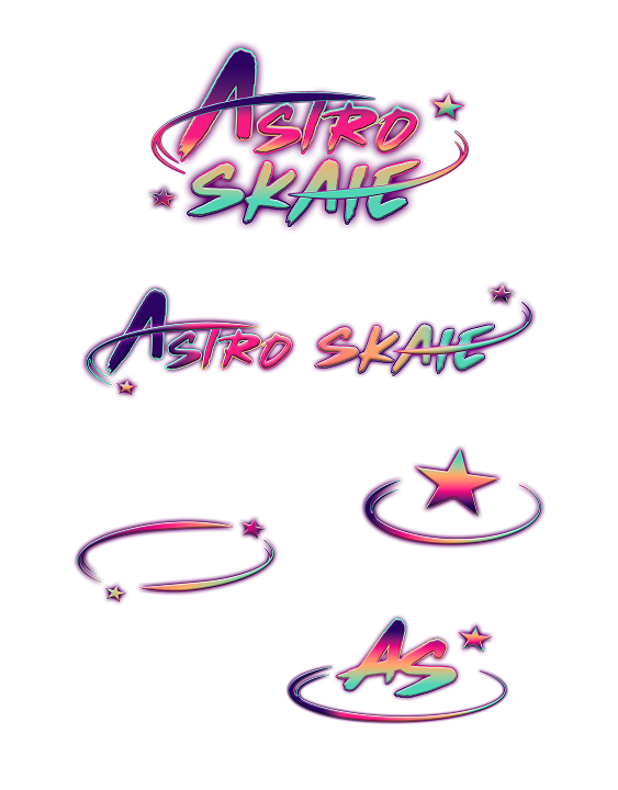
The logo began with quick sketches focused on movement and energy. I explored different typographic styles and shapes to reflect the dynamic nature of skating.

Through refinement, the final mark became a balance of personality and clarity, allowing it to scale across multiple formats.
05  BRAND SYSTEM

Creating consistency across every detail

Once the identity was established, I expanded it across multiple brand materials, including print collateral and supporting assets.

Each piece was designed to feel connected, reinforcing the idea of a cohesive system rather than standalone designs.
06 APPLICATIONS

Bringing the brand into real world spaces

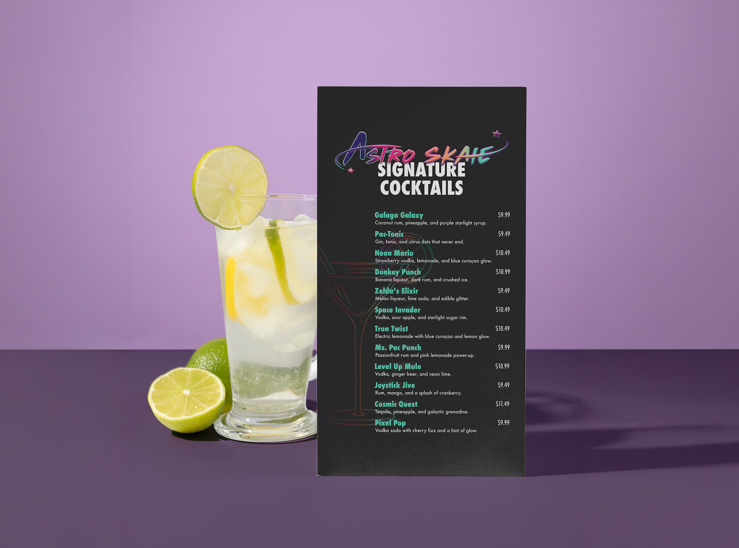
I applied the system across magazine layouts, digital content, and environmental designs to show how it functions in different contexts.

These applications helped transform the concept into a fully realized and interactive experience.
07 REFLECTION

Bringing everything together

Astro Skate became a cohesive brand system that captures both nostalgia and modern design. Each element works together to create a recognizable and immersive experience. This project strengthened my ability to balance expressive visuals with clarity and control. It reinforced the importance of building systems that feel both dynamic and functional.

Reflection:
This project pushed me to find the balance between bold design and restraint. I learned how important it is to control visual energy so the system remains cohesive rather than overwhelming. If I were to continue developing this project, I would explore motion and interactive elements to further enhance the immersive experience.