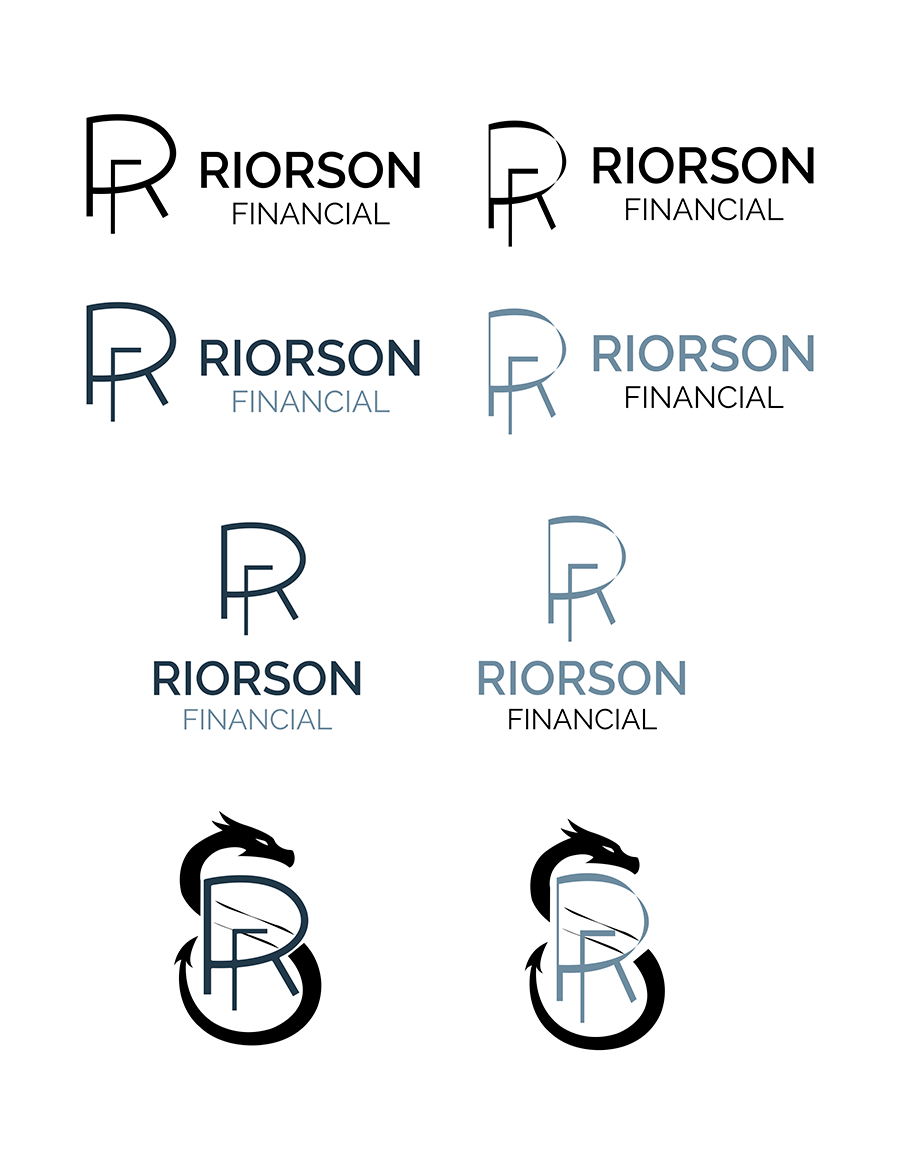
Riorson Financial is a modern investment firm focused on clarity, confidence, and long term trust. The goal was to create a refined identity that communicates professionalism across all touchpoints.
The system needed to feel structured, reliable, and scalable while maintaining a modern presence.
01 OVERVIEW
Building a clear and cohesive identity
This project focused on developing a full brand system that works across both print and digital formats.
The goal was to create a consistent visual language that reinforces trust and clarity in every application.
02 THE CHALLENGE
Standing out while maintaining trust
The financial industry often relies on similar visual styles, making it difficult to stand out without losing credibility.
The challenge was creating something modern and distinctive while still feeling professional and reliable.
03 VISUAL IDENTITY
Defining a structured visual language
The identity uses a restrained color palette and structured layouts to create clarity and hierarchy.
Each design decision reinforces the brand’s focus on organization and trust.
04 LOGO DESIGN
Refining the identity through iteration
The logo was developed through multiple iterations, focusing on balance, clarity, and adaptability.
The final mark is clean, modern, and scalable across different formats.
05 APPLICATION
Applying the system across touchpoints
The identity was extended across business materials and print assets to ensure consistency.
Each application reinforces the brand’s structure while adapting to its specific use.
06 CAMPAIGN
Extending the brand through communication
Campaign materials were developed to show how the brand communicates visually in more dynamic formats.
These pieces maintain consistency while allowing for engagement and variation.
07 REFLECTION
Bringing everything together
Riorson Financial became a refined and scalable brand system built on clarity and trust. Each element works together to create a consistent and professional identity across all touchpoints.This project strengthened my ability to design within structured systems and communicate professionalism through design.
Reflection: This project pushed me to focus on clarity and restraint rather than visual complexity. I learned how small design decisions can have a strong impact on how trustworthy a brand feels.If I were to continue developing this project, I would explore more interactive digital elements while maintaining the same level of structure.